.webp)
Need help? We’re here!
Our expert customer service team is ready to help you with any questions or concerns you may have. Real time help is available Monday through Friday 9AM - 6PM EST- (888) 391-7165
- Chat live with support
- support@sheetlabels.com
At SheetLabels.com, customers can request samples of all of the products we currently offer.
Order Free Samples
Effective label design is crucial for making your products stand out and attracting customers. Whether you’re a seasoned designer or just getting started, these tips will help you create labels that not only look great but also convey your brand message clearly.
Create an eye-catching label by balancing decorative elements and using white space effectively. Pair complementary fonts to differentiate information and stick to two or three colors to avoid clutter. Ensure readability from a distance by stepping back and assessing the design’s visibility. Simplify by removing unnecessary elements to enhance clarity and impact.
Did you know 70% of consumers say packaging design influences their purchasing decisions? In the bustling market, your product's label isn't just a sticker; it's the silent salesperson that whispers to potential buyers. Crafting a compelling label design is crucial for standing out on crowded shelves and creating a memorable brand experience. Whether you're launching a new product or looking to refresh an existing one, mastering label design tips can significantly impact your product's success. From understanding color psychology to choosing the right font, these insider strategies are designed to capture attention and convey your brand's story at a glance. Dive into these expert insights and elevate your product's appeal with effective label design.
A clean and simple label design ensures clarity. Avoid clutter by focusing on essential information and using white space effectively.
Minimalistic design grabs customer attention fast. It makes your product stand out on crowded shelves. Brands like Apple have shown how simplicity boosts recognition.
Using fewer colors and simple graphics sends a clear message. It tells customers what they need to know without confusion. This approach, incorporating creative label design ideas, not only looks clean but also enhances brand recognition.
Unique color combinations can make your label stand out. Consider using unconventional palettes that resonate with your target audience and evoke the right emotions.
Colors impact how people feel about products. You may have heard that red can evoke excitement, while blue might calm people down, but color is highly contextual. A calming red sunset suggests something completely different than blue lightning. Choosing the right color scheme is crucial for connecting with consumers on an emotional level.
No matter what colors you choose your first goal is to attract your buyer’s eye. Is your product can to be on a busy shelf or boutique? Know your audience and the environments they’re likely to be shopping in. Design a label that meets fundamental expectations, but differentiate them with color. Have fun and experiment!
Experimenting with contrasting colors can improve readability and make your labels more attractive. This balance is key to catching the eye of potential buyers.
Choose fonts that are both stylish and readable. Pair complementary fonts to highlight important information and maintain a cohesive look.
The font you choose plays a big role in how easy it is to read your label. It also says a lot about your brand's personality. For instance, a fun, whimsical font might be great for a children's product, while a sleek, modern typeface could suit high-end electronics.
Combining different fonts can add hierarchy and interest to your label design. Just make sure not to go overboard. Too many typefaces can clutter your design and confuse the message. Keeping typography consistent across all branding materials helps create a cohesive look.
Consider eco-friendly materials and design labels that can be repurposed or recycled, appealing to environmentally conscious consumers.
Creating labels that encourage repurposing or recycling can significantly impact customer loyalty. Including features like peel-off stickers or designs that customers might want to keep or collect adds value beyond the initial purchase.
Incorporating reusable elements into your label design shows you care about the environment. This eco-conscious approach can foster long-term brand loyalty among consumers who value sustainability.
Incorporate eye-catching graphics and imagery that align with your brand’s message. Ensure visuals are high quality and relevant.
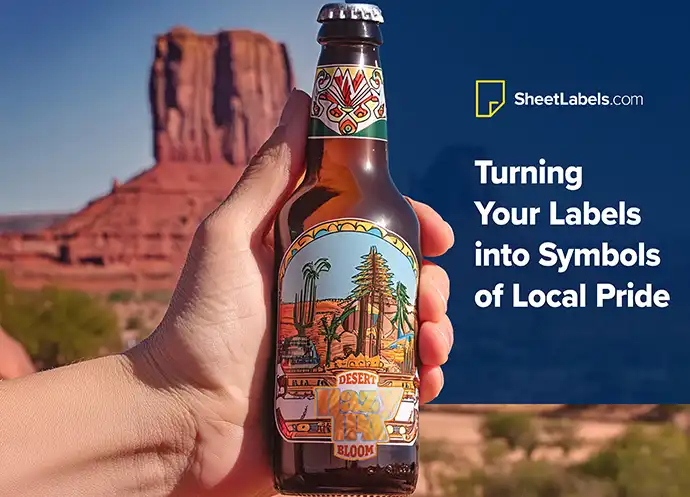
Using unique illustrations or photography can make labels truly stand out. These visuals not only grab attention but also tell a story. They create an emotional connection that words alone cannot achieve.
Integrating visuals with text ensures the label tells a cohesive story. This blend enhances the overall design, making it more appealing and memorable.
Include recipes, tips, or fun facts on the label to engage customers and enhance their experience with your product.
Adding QR codes or augmented reality features to labels offers an interactive experience. This modern touch can transform a simple label into a gateway for deeper brand engagement.
Including recipes, tips, or fun facts about the product adds value. It turns every purchase into an opportunity for customers to learn and engage. This approach not only enhances the customer's experience but also builds brand loyalty.
Combine modern and vintage elements to create a unique aesthetic. This approach can attract a diverse audience by blending nostalgia with contemporary design.
Combining modern and vintage elements in label design can appeal to a wide audience. This fusion creates a unique aesthetic that captures the best of both worlds. It blends nostalgia with contemporary design, making products stand out on shelves.
Successful label designs often use this blend to attract customers who appreciate both old-world charm and modern simplicity. Examples include craft beer labels or artisanal food packaging, where this fusion is commonly seen.
Use textures, irregular fonts, and hand-drawn elements to give labels an artisanal feel, suggesting quality and care.
Textures, irregular fonts, and hand-drawn elements give labels a handcrafted feel. This style conveys authenticity and suggests that the product is made with care.
Handcrafted designs resonate with consumers looking for artisanal quality. Recommending materials and printing techniques that mimic handmade items can enhance this effect, making products more appealing.
Turn labels into engaging experiences by adding elements like scratch-offs or peel-aways. These features can reveal hidden messages or special offers, making the unboxing process memorable. They make the unboxing process memorable. Customers often share these unique experiences on social media. This boosts your brand's visibility.
Designing interactive labels requires careful planning. You must consider the materials and printing techniques. Ensure they function as intended without compromising the product's integrity. It's a balance between creativity and practicality.

Use witty or pun-filled labels to make your brand more relatable and memorable. Ensure the humor aligns with your brand voice and audience expectations. They leave a lasting impression on consumers. Brands like Ben & Jerry’s have mastered this art. Their ice cream flavors often feature playful names and descriptions.
However, humor must align with your brand voice and audience expectations. Misjudged jokes can alienate customers rather than attract them. It's crucial to know your audience well.
Create buzz with limited edition labels for special occasions or collaborations. Highlight the uniqueness and scarcity to encourage quick purchases. They're perfect for special occasions or collaborations. These editions signal exclusivity, making customers feel part of an elite group. This sense of urgency can drive sales significantly.
Announce limited runs through your marketing channels to maximize their impact. Highlight the uniqueness and scarcity of these editions to encourage quick purchases.
Blend modern typography with classic imagery to create timeless designs that appeal to both younger audiences and traditionalists. It suggests innovation while respecting heritage. Brands like Coca-Cola excel in this area. They maintain their iconic script logo but regularly introduce modern design elements.
Finding the right balance is key. Too much tradition may seem outdated, while too much modernity may lose the brand's essence.
Labels do more than just stick to a package. They tell a story that goes beyond the shelf. When designing labels, think about how they fit into your brand's larger narrative. This approach can make your product stand out in a crowded market.
Labels should also work with your digital marketing. For example, a QR code on a label can link to a social media campaign. This creates a seamless experience from physical to digital spaces. It helps guide customers along their journey from discovery to purchase and encourages them to come back for more.
A cohesive design across all sides of packaging is crucial. It ensures your product makes the maximum visual impact on potential buyers. Think of your label as a wrap-around canvas that tells a story from every angle.
The back label is not just for legal jargon or ingredients. Use this space for storytelling or sharing more about your product. But keep it clutter-free. Consistency is key when designing for different viewing angles. Your brand's identity should be recognizable no matter how the product sits on the shelf.
Consider turning your labels into an interactive experience. Adding puzzles, games, or DIY projects can engage customers directly with your packaging. This not only enhances the product experience but also boosts retention and encourages repeat purchases.
Activity-based labels are a clever way to stand out. They turn passive buyers into active participants. Brands like Jones Soda and Seedlip have found success by incorporating such activities into their labels, creating memorable experiences for their customers.
Experiment with bold and unconventional color combinations to catch the eye. Test colors with your target market to ensure they resonate well.
Choosing the right colors can make a label stand out. It's wise to explore unconventional color combinations. These unique mixes can catch a customer's eye among rows of products.
Research is key in this process. Before settling on a palette, companies should test colors with their target market. This ensures the chosen hues resonate well.
Color psychology plays a crucial role too. Different colors evoke different emotions. For example, blue can convey trust, while green might suggest eco-friendliness. Understanding these associations helps brands connect with their audience on a deeper level.
Incorporate techniques like embossing and debossing to add depth and tactile interest to your labels. Choose materials that enhance the desired texture.
The feel of a label is just as important as its look. Techniques like embossing and debossing add depth. They make labels more engaging to touch.
A textured label can elevate a product's perceived value. It suggests quality and care in production, influencing buyers positively.
When it comes to materials, choices matter. Some textures are best achieved with certain papers or finishes. Brands should work closely with printers to select the best options for their design goals.
Handwritten fonts add personality and warmth to labels, making products feel personal and authentic. Ensure the font is legible and matches the brand identity. They make products feel personal and authentic. However, choosing the right handwritten font requires a balance. It must be legible yet stylish enough to stand out. Brands like Coca-Cola and Chobani have mastered this, using handwritten fonts to convey authenticity and approachability.
It's important not to sacrifice readability for style. Some script fonts can be hard to read, especially on smaller labels. When selecting a handwritten font, consider its application. Will it be easy to read at a glance? Does it fit the brand's identity? These questions guide designers toward making effective choices.
Focus on font size, spacing, and hierarchy to ensure readability. Use different font sizes and weights to highlight key information and guide the eye smoothly.
The basics of typography—font size, spacing, and hierarchy—are crucial for label readability. A well-designed label guides the eye through the information smoothly. Font size ensures that all text is accessible, while spacing prevents clutter. Hierarchy, achieved through different font sizes and weights, highlights the most important information.
Typography also plays a significant role in conveying brand identity. The right font choices can express the brand's personality and values without a single word. For example, bold, blocky fonts might suggest strength and reliability, suitable for sports equipment labels. Delicate serif fonts could indicate elegance, perfect for beauty product labels.
When combining fonts, aim for harmony rather than conflict. A common guideline is to pair a serif with a sans-serif to balance readability with character. The key is consistency; too many different fonts can confuse and overwhelm the viewer.
Choose sustainable materials like recycled paper or biodegradable plastics. These options reduce waste and appeal to eco-conscious consumers.
These materials offer a dual benefit. They're good for the planet and appeal to eco-conscious consumers.
Marketing benefits are significant. Products with green labels stand out on shelves. Environmental benefits are just as important. Using these materials cuts down on resource use and landfill waste.
Certification labels matter too. Symbols like the Green Seal or FSC (Forest Stewardship Council) logo tell shoppers a product is eco-friendly. They make it easy for consumers to choose greener options.
Consider the entire lifecycle of the label, from production to disposal. Use simple designs with minimal ink and materials that are easy to recycle.
Designing labels with the environment in mind is about more than just materials. It's about considering a label's entire lifecycle. From production to disposal, every step should minimize environmental impact.
Material choice is key. But so is design efficiency. Simple designs use less ink and fewer resources. They can also be easier to recycle.
Labels can communicate a brand's environmental commitment. This might mean using symbols that show a product is recyclable or made from recycled materials. It could also involve sharing the brand's sustainability story directly on the packaging.
Ensure every element on the label reflects your brand’s core values and personality. Maintain consistency across products to unify the brand image.
Labels do more than just display a product's name. They are a brand's handshake with its customers, offering a first impression that can last. To convey the essence of a brand, every element on the label must speak to the core values and personality that the company stands for. This means distilling complex brand stories into compelling visual and textual elements that resonate on an emotional level.
A strategy for achieving this involves maintaining consistency across various products and packaging types. This doesn't mean every label should look the same but rather that they should all feel like part of a family. For instance, using a consistent color scheme, typography, or logo placement can help unify different products under the same brand umbrella.
Use the label to tell your brand’s story and connect with customers on an emotional level. Highlight what makes your brand unique and trustworthy.
The power of storytelling in label design cannot be overstated. It creates an emotional connection with consumers by bringing them into the world of the brand. By incorporating elements of the brand's history, sourcing stories, or artisanal processes into the label design, companies can forge deeper connections with their audience. This approach not only captivates but also builds trust and loyalty by showing consumers the people and processes behind the product.
Balancing authenticity with marketing objectives is crucial. It's about finding the sweet spot where genuine stories align with what consumers need to know to make a purchase decision. For example, if sustainability was highlighted in the previous section as important to your brand, then integrating that message into your label design reinforces your commitment to those values without feeling forced or purely promotional.
Study successful label designs from leading brands to gather ideas and inspiration. Look at how they use color, typography, and visuals to create impactful labels.
Sources like art, nature, and historical packaging offer endless inspiration for label design. Each element, including creative label design ideas, can bring a unique touch to a brand's identity, making products stand out on the shelves. For instance, patterns found in nature can inspire organic and fluid designs that appeal to eco-friendly brands. Art movements, such as Art Deco or Pop Art, provide rich palettes and shapes for bold, eye-catching labels.
Adapting these inspirations to fit a brand requires a deep understanding of the brand's core values and target market. It's not just about copying an attractive design but integrating it seamlessly with what the product represents.
Keeping a design inspiration portfolio is also crucial. It helps designers stay updated with trends and revisit past ideas for new projects. This portfolio can include photographs, magazine clippings, or even fabric samples—anything that sparks creativity.
The diversity in label design is vast, ranging from minimalist approaches that focus on clean lines and simple colors to elaborate designs filled with intricate details. For example, wine labels often feature elegant typography and subtle textures, reflecting the sophistication of the product inside. On the other hand, craft beer labels might lean towards more vibrant and quirky designs that capture the brand's playful spirit.
One innovative label design comes from a boutique olive oil brand that uses transparent labels with delicate floral prints. This design allows the color of the oil to become part of the visual experience, showcasing the product's purity and quality. Another example is a coffee brand that incorporates interactive elements into its labels, such as scratch-off areas revealing information about the coffee's origin.
These examples teach us valuable lessons about pushing boundaries and thinking outside the box. They show how diverse materials and printing techniques can create memorable and impactful designs. By studying these cases, designers can find new ways to tell a brand's story through its packaging.
Great label design is more than aesthetics; it’s about creating a connection with your audience. Use these tips to transform your labels from ordinary to unforgettable.
Now, it's your turn to innovate. Take these insights, blend them with your brand's unique voice, and create labels that not only stand out on the shelves but also resonate with your audience. Remember, great design is more than aesthetics; it's about connection. Ready to make your mark? Start designing today and watch your products transform from ordinary to unforgettable.
Understanding label design basics involves recognizing the importance of clarity, readability, and visual appeal. It's about making sure your label communicates the essential information effectively while attracting attention and understanding how to design labels that sell.
Enhancing visual appeal can be achieved by using vibrant colors, engaging graphics, and a layout that guides the viewer's eye. Focus on creating a design that stands out while staying true to your brand identity.
Innovating label ideas include using unique shapes, interactive elements like QR codes, or materials that change appearance under different lighting. Think outside the box to capture interest and engage your audience.
Functionality is crucial in label design. Your label should not only look good but also withstand handling and storage conditions, provide necessary product information clearly, and comply with any regulatory requirements. It's about balancing aesthetics with practicality.
Color and texture greatly impact how consumers perceive your product. They can evoke emotions, convey brand values, and highlight important features. Choosing the right combination can significantly enhance your product's shelf appeal.
Typography in label design is vital for readability and setting the tone of your message. The right font choice can make your label appear more professional, approachable, or luxurious, depending on your brand’s personality.
Sustainability in label design reflects a commitment to environmental responsibility. Using eco-friendly materials and processes not only appeals to eco-conscious consumers but also demonstrates your brand's dedication to making a positive impact.
Branding is key in label design as it ensures consistency across products and helps build recognition and trust with your audience. A well-designed label reflects your brand identity and values, making your product instantly recognizable.
Effective label designs often come from understanding the target market and creatively addressing their needs and preferences. Case studies and inspirations from successful brands can offer valuable insights into what works well in various industries.